


Books by their Cover from the AIA/SCS Book Room
- Jan 8, 2020
- 4 min read
There was a day when I wandered the book room at the annual joint meeting of the Archaeological Institute of America and Society for Classical Studies looking for the latest publication. These days, my shelves overflow with books that I don’t have time to read and grabbing the latest word in Late Antiquity or Mediterranean archaeology, while always exciting, is probably too ambitious for my current station in life.
Now, I tend to wander the book room on the look out for the snazziest book covers. There were some really great covers (and many of them were so distracting that I didn’t bother to look when the book was published, so some of these books are probably not new).
The first book that grabbed my eye was Andrew Miller’s new translation of Pindar’s Odesand Charles Martin’s translation of Euripides Media. As with most black covers, these are showing signs of handling, which is always unfortunate, but the stylized letters are just too great a design to not set against a matte black background.

I love when presses have a great design that extends easily over an entire series. University of Texas Press’s series The Oratory of Classical Greece uses a similarly restrained color palette and consistent graphics and fonts to produce an appealing and recognizable identity.

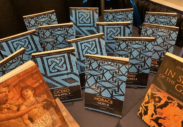
Bloomsbury’s Classical Languages series also produces a distinct and recognizable (and appealing) gaggle of books:
I found myself stopped at the University of Chicago Press tables less because of their consistently interesting content and more because their little swarm of books on editing, writing, and publishing used bold colors and designs to show off their family relationship without using a template.

Single books offer a less constrained design vocabulary and I’m always surprised by the range of designs that simply work to create an arresting and interesting cover. For example, I’ve often been caught looking at Owen P. Doonan’s Sinop Landscapes: Exploring Connection in a Black Sea Hinterland which appeared in 2004 (!). Maybe it’s understated design speaks to a slightly less crowded or graphically ambitious book market? Or maybe it just works?

It goes without saying the use of a black and white photo and a black cover does nothing to hide its dated vibe, but in the right hands, a vintage aesthetic really can work. For example, I love the cover of Herodotus and the Question Why by Christopher Pelling from University of Texas Press. The use of blue and orange creates just enough chromostereopsis to make the book pop. Plus that color way is really hip these days (and to me, it evokes the vintage color of Gulf as seen in this watch and on this car.)

Texas has long done cool stuff with vintage style covers. Deborah Lyons’s Dangerous Gifts (2012) almost always catches my eye even when surrounded by more recent titles.

The cover of Laura Pfuntner’s book, Urbanism and Empire in Roman Sicily, is just great as well. I love the floor plans in the colored blocks.

As an aside, Texas also really did a nice job with the cover of Hanif Abdurraqib’s book, Go Ahead in the Rain: Notes to the Tribe Called Quest even if the “This is a book by…” thing is a bit tired (where did this start? I remember it on the Black Keys’ album Brothers, but it must be from something else?).
Princeton has used a similarly paired down and graphically bold aesthetic for the cover of Walter Scheidel’s edited volume, The Science of Roman History, that came out last year. I like it.

There’s something to be said for less minimalist covers too, of course. I love the cover to Frankenstein and Its Classics The Modern Prometheus from Antiquity to Science Fiction edited by Jesse Weiner, Benjamin Eldon Stevens, Brett M. Rogers from Bloomsbury.

I’m guessing the same designer did the cover to Brett M. Rogers’s and Benjamin Eldon Stevens’s Once and Future Antiquities in Science Fiction and Fantasy.

The cover of the ISAW Monograph, An Oasis City edited by Roger S. Bagnall , Nicola Aravecchia , Raffaella Cribiore , Paola Davoli , Olaf E. Kaper and Susanna McFadden and published in conjunction with NYU Press combines business with black and white to create a cover that has caught my eye for several years now.

For more conventional covers, University of Wisconsin Press created a show stopper with their cover of Sarah Rous’s Reset in Stone. The cover not only grabbed my attention but also made me stop and think about how the contrast between white marble and saturated blue skies create a kind of trope for Hellenism (and this led me to think about how these kinds of images are used and reused over time).

I assume that the same designer produced the cover to Spear-Won Land: Sardis from the King’s Peace to the Peace of Apamea edited by Andrea M. Berlin and Paul J. Kosmin.

Finally, the coolest cover that I saw last week had to be Thelma Thomas’s Designing Identity: The Power of Textiles in Late Antiquity. This book came out in 2016 in association with an exhibit at NYU’s ISAW. I had heard of the book and maybe even read a review of it, but for whatever reason hadn’t seen it in the paper. The cover is distractingly great.

Over the past few years, I’ve been struck by how hard it has become to find the time (or even a method) to keep atop the incredible output of books in archaeology, Classics, and ancient history. I’ve also heard more than one colleague mutter, usually in frustration more than anything, “everybody has a book these days,” and this certainly feels like it might be true. Despite the seemingly overwhelming output of publications, it’s nice to see presses committed to such amazing cover designs. It makes the numbing guilt of not being able to read everything that I want to read worth a trip throughs the book room!

Comments