


Deserted Villages: Perspectives from the Eastern Mediterranean
- Dec 21, 2020
- 3 min read
I spent this weekend typesetting a new book for The Digital Press at the University of North Dakota: Deserted Villages: Perspectives from the Eastern Mediterranean edited by Rebecca Seifried and Deborah Brown Stewart. It should be out in early 2021.
I’m excited about this book for quite a few reasons. First, this book is the third publication based on the work of the Medieval and Post-Medieval Archaeology Interest Group of the Archaeological Institute of America. This book is a heavily revised selection of papers from a panel titled “Deserted Villages” held at the 117th Annual Meeting of the AIA in 2016. This has significant personal meaning as a number of us founded this group 15 years ago to support and encourage the growing interest in Medieval archaeology present at the AIA. It’s exciting to see that the group continues to have momentum and has expanded its reach.
Next, and more substantively, the chapters in the book are really, really good. These are not warmed-over conference papers, but carefully peer-reviewed, substantial, and engaged works of archaeological interpretation. In fact, almost every chapter in the book involves the publication of new archaeological material, analysis, and interpretation. Most run to over 40 pages in length. The introduction blends theoretical and regional perspectives to set up the volume.
Finally, on a more personal note, the volume includes a paper that David Pettegrew and I have book working on for almost 20 years. The chapter publishes for the first time our longitudinal study of the houses and landscape of a site called Lakka Skoutara in the southeastern Corinthia.This is a settlement site that we happened upon in (I’m guessing here) 2001 as part of the Eastern Korinthia Archaeological Survey and started to document as, what we then called, a “formation process playground.” Around 20 abandoned Balkan-style long-houses stood in a broad valley in various states of abandonment and collapse. Over the past 20 years, we witnessed some of them collapse, others be refurbished, and some continue to dissipate into the insect-infested olive groves. I can’t wait for people to finally read our work.
The book is also a model of how a collaborative, scholar-led, press can work. The peer reviewers offered meaningful and incisive feedback on all of the manuscripts most of which went through at least two rounds of substantive revision. The manuscript itself have been copy edited by Rebecca Seifried, who is an archaeologist, librarian, and copy editor (who has copy edited other books for the Press in the past). Her attention to detail combine with the editors concern for length and tone to give the volume a cohesive and polished character.
The editors have also contributed to the overall look of the volume. They suggested that we typeset the book in the open-source Cardo font. I’ve added chapter titles and author names in Proxima Nova (to give the book a little continuity with other Digital Press titles). The main text block is 10 point which might look a little on the large side on the paper page, but will make the book more easy to read on tablets and computer screens.
The editors have also enthusiastically contributed book cover ideas which makes my life much easier and is really fun.
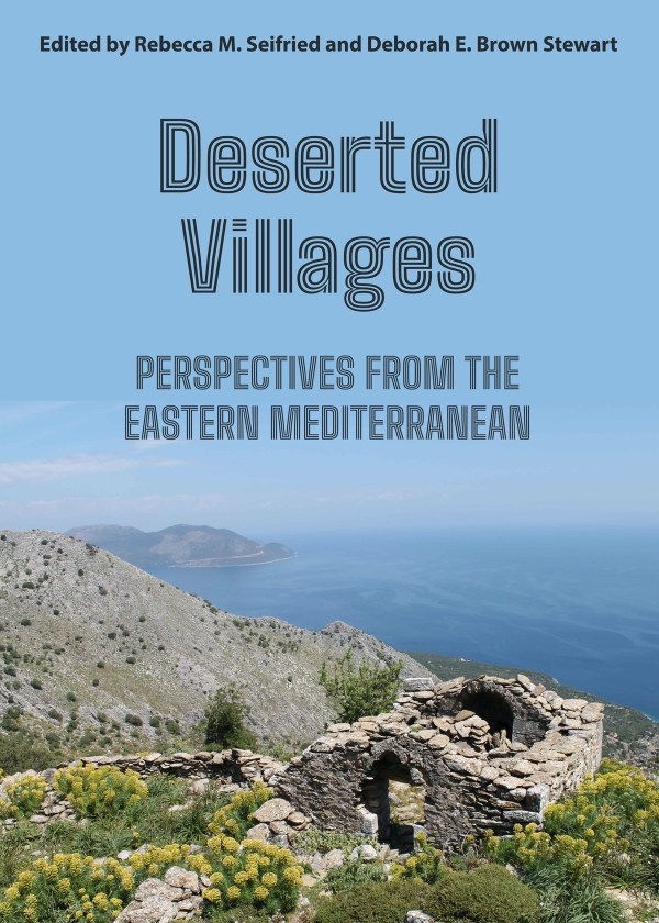
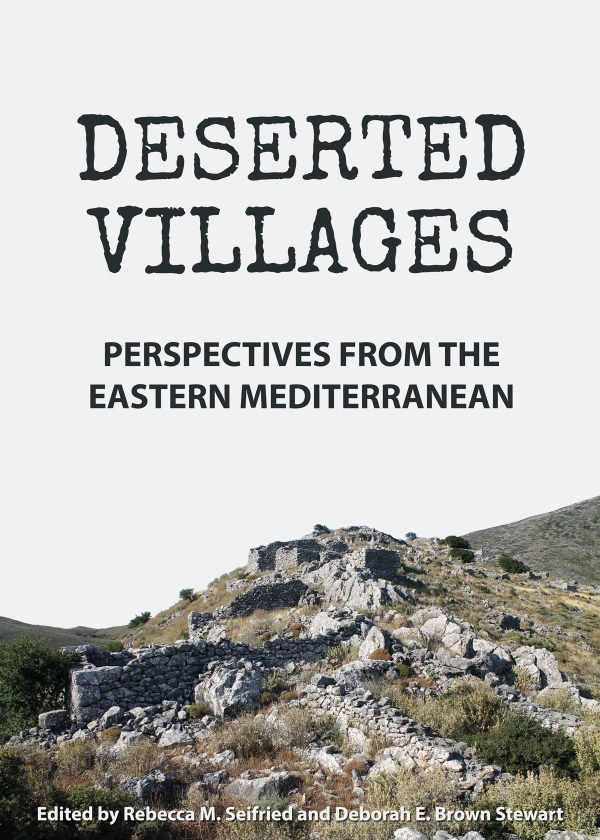
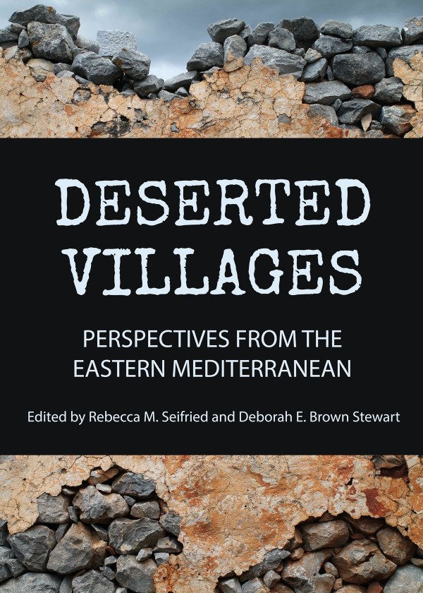
Here are a few of the ideas that we’ve been bandying about:
Cover 1: I’m partial to the image here and sort of like the funky font, but it might not be as legible as I would want it when it’s reduced to a grainy little thumbnail on the Amazon page.
Cover 2: I like the “olde tyme” or Medieval font and the image, but the sky feels too washed out to me.

Cover 2.1: This uses a slightly different font on the same cover. On the whole, I think the more “manuscripty” font works better than this typewritten one, but I still like it!
Cover 3: This cover may be my favorite (although I really like Cover 1 as well). There’s something really archaeological about it and the black text box makes the title pop. I wonder if it would look good with the more Medieval font in Cover 2? I also love the dark clouds in the sky behind the wall.
As always, feedback on these cover is welcome and encouraged!


Comments