


The New Website at UND
Yesterday slightly after noon, the University of North Dakota rolled out its new website. I was on the “Web Oversight Committee” which played a role in the site’s overall design and organization. Over the past 8 months, a team on campus took on the challenge of taking a design and making it a functional website. They have also worked to mate the site with a new approach to developing content for the web and to bring to the site a new commitment to social media.
The site clearly shows signs of haste with dead links, proofreading issues, and questionable functionality throughout. On the other other hand, the new site now has a content management system operating behind the scenes which will make it much easier to iron out cosmetic and functional issues on the fly. While I would have probably cleaned up some of the more glaring issues prior to launch, it is difficult to stop progress (as they say). The hope is that by the end of the academic year the entire university will follow the same basic set of design cues with a much clearer set of global navigation menus. There is thought that this will promote a sense of shared identity.
This re-design has marked probably the 15th major redesign to the university home page since it was introduced in 1996. The Internet Archive began collecting examples of the web page beginning in 1998.

The clean appearance and good use of negative space in the first archived site carried onto the next few iterations where the most significant design adjustments tended to be in the header.
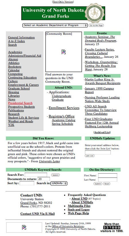
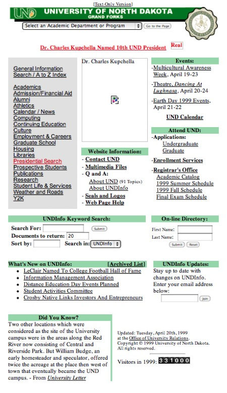
There were at least three different headers in 1999 alone:
2000 marked the first significant redesign to the page with less of an emphasis on negative space and design and more of an emphasis on functionality. I love the Geocities-esque UND-branded wall paper. The prominent menus hardly seem appropriate for any homepage, so at first I wondered whether the archived copy of the site was corrupt.
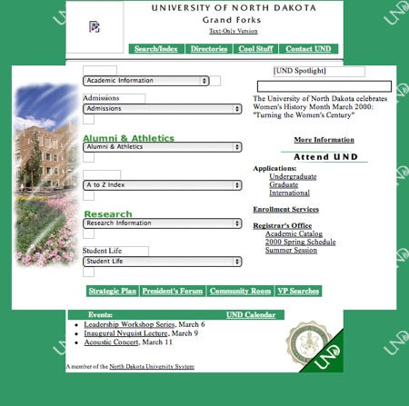
But the same basic design appears in 2001:

By 2002, however, better design sense prevails. Even without the menu bars in the archived copy of the page, the basic design present a content in a far more accessible and aesthetically pleasing way:

This version seems to have only been a stepping stone to a major redesign in late 2002. I am partial to the bold fonts, the simple header, and the nice use of negative white space, but perhaps the page lacked visual impact. It is possible to see the beginning of the three column layout that UND will continue to adapt even until today.
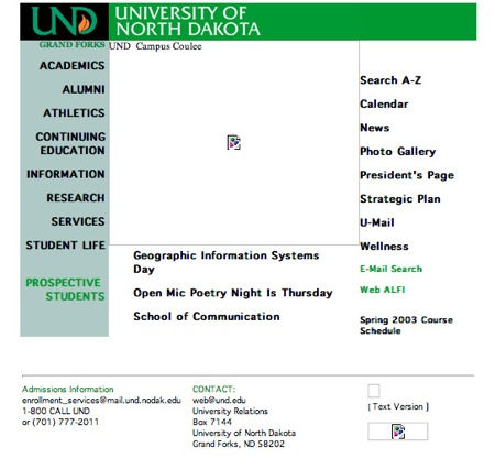
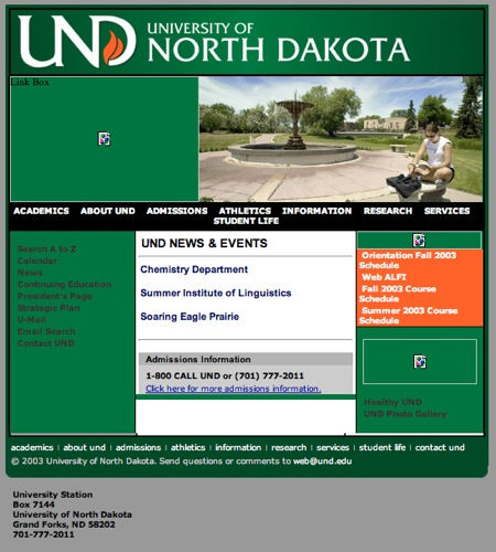
The 2003 redesign was to be one of the most enduring. The white background is gone and replaced with a matte-grey. Images feature prominently on the page and a basic three column layout emerges from the more chaotic earlier designs. The link box to the left of the picture shows a continued interest in sacrificing some visual impact to functionality by using prime space for images as space for menus. Also note that the bold and stark colors of the header have given way to subtle shading adding a bit of depth to the page. The logo is huge.
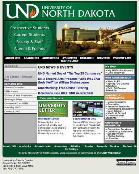
2004 continued the basic design of 2003 but refined the space below the main picture to include links to a wide range of content. The right column has become a bit cluttered compared to earlier versions of the page suggesting that the main site was increasingly used as the basic point of access to daily information and web based applications like email and Blackboard. This was the home page when I started at UND so I have some sentimental attachment to it.
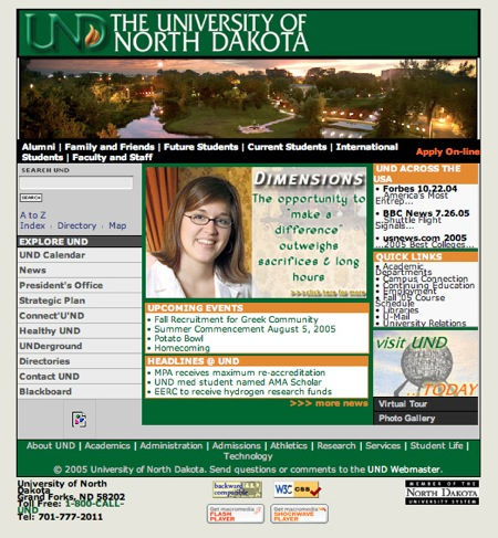
By 2005, perhaps people reconsidered the huge UND in the header of the page and improved bandwidth and server software made it easier to include snazzy images across the entire page and include a smaller image in the central column. Otherwise the basic design remained the same.
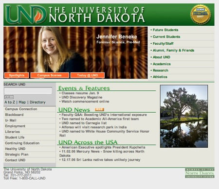
2006 marked a major redesign in the page. The return menu items to the upper part of the page but also return the image to the size that it was in 2004. The same three column design exists for the section “under the fold”, but with a better use of negative space and less abrupt horizontal divisions. The menu on the left shows a slight change in priorities for the webpage.
The last major redesign prior to 2010 came in late 2008 or early 2009. The page has a slightly greater emphasis on content. It continues the basic three column design, but features content below a basic menu area which now divides the screen between image space and content space (the menu isn’t visible in this screen shot). Note also the appearance of social media icons in the right column.
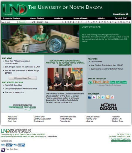
The new page uses the main image space more completely and keeps the menu bar as the division between the image and the rest of the page. Below the menu bar the long-standing, 3-column organization continues. Below that, however, is yet another set of column designed to bring social media to the home page. The struggle with UND branding on the page appears to continue. In the newest page the logo and name are smaller and appear on a transparent band the gives the site some depth and contrast (and saves our eyeballs from the onslaught of kelly green).


Comments