


Typesetting
- Mar 19
- 2 min read
Over the last week or so, I’ve been playing around with some page designs for a book project set to come out later this spring. The book is a multi-genre memoir that includes essays, poetry, and writing with a distinctly spiritual cast. The manuscript was brought to me by Paul Worley. Paul noted that its blend of Americana, spirituality, and plainspokenness evoked the Beat generation, and I tend to agree with him. That said, the book isn’t derivative. It has a kind of genuine character that is untamed, pure, and true.
Finding a mise-en-page that will reflect the character of the book has proven a bit challenging. I wanted to make the pages unique and distinctive, but also familiar. I’m going with a 5 x 8 book size so the text block will narrow and well suited for poetry. At the same time, I want the font generous and plenty of room for white space.
I got to thinking about Lawrence Ferlinghetti’s City Lights Pocket Poet volumes. The austerity of the covers, the abundant use of white space, and the generous leading (the space between the lines).
Here’s a page of Ginsberg’s The Fall of America: Poems of These States, 1965–1971 (1972).
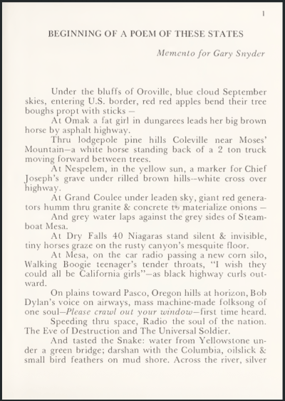
I took that as inspiration and adapted it to the particular book and contemporary sensibilities. I went with larger margins and a narrower text block. 11 point Miller Text for the main body with 16 point leading. The title is Acumin semibold in 16 point. The date is simply Miller Text italics.
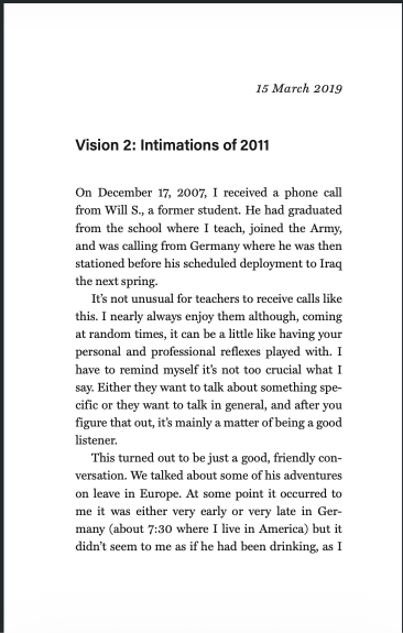
I shared some variations of this page with different fonts and leading with my students in our Practicum in Writing, Editing, and Publishing and they helped guide this mise-en-page into being. This weekend, I’ll be making a book!
Comments